


Plotting with Seaborn and Maplotlib
Libraries for plotting
The traditional Python library for plotting (or data visualization) is Matplotlib. This is a comprehensive library that allows you to create any kind of plot that you can think of. However, Matplotlib can be cumbersome to use. Therefore, Seaborn was built on top of Matplotlib to make it easier to create common plot types, such as bar plots, or line plots (which Seaborn calls 'point plots').
Plotting simple lines and dots
It is convention to import matplotlib.pyplot as plt. This is the module that contains most of the plotting functions. The main plotting function is plt.plot(). You can call plt.plot() multiple times, and then call plt.show() to show the resulting plot. If you do this from a code editor that supports this, such as Rapunzel or Spyder, the plot will be shown in the interactive console. Otherwise the plot will pop up in a separate window.
from matplotlib import pyplot as plt

# Simplest case: only specify Y values
plt.plot([10, 11])
# Specfy both X and Y values
plt.plot([0, 1], [11, 10])
# Also specify a line format (circles with dotted lines) and a color
plt.plot([0, 1], [10.5, 10.5], 'o:', color='blue')
plt.show()
There are many functions to make your plot look better, for example by adding labels to the axes. You can find a list of all functions here.
Let's consider a slightly more realistic example: a scatterplot of movie ratings over the years, based on this data.
from datamatrix import io

dm = io.readxlsx('data/movies.xlsx')
# The ',' format indicates tiny markers without lines
plt.plot(dm.year, dm.rating, ',')
plt.xlabel('Year')
plt.ylabel('Rating')
plt.title('Movie ratings over the years')
plt.show()
Creating common plots
Point plot (also: line plot)
It is convention to import seaborn as sns. Seaborn is not as powerful as Matplotlib, but it has several convenient functions for creating common plot types. Often you will still use Matplotlib in addition to Seaborn to perfect your plot, for example by adding labels.
Most Seaborn functions, including sns.pointplot(), take a DataMatrix or DataFrame object with the data keyword. You also need to specify which columns should be used for the X and the Y axes. You can optionally specify a hue keyword (not used here), which specifies a column that should be used to draw differently colored lines (in the case of a point plot), differently colored bars (in the case of a bar plot), etc.
import seaborn as sns

dm90s = (dm.year > 1990) & (dm.year < 2000)
sns.pointplot(x='year', y='rating', data=dm90s)
plt.xlabel('Year')
plt.ylabel('Rating')
plt.show()
Bar plot
Let's again consider this dataset from Moore, McCabe, & Craig (included as example data with JASP). This data contains the heart rate of male and female runners and control participants. So let's plot heart rate as a function of Gender (X axis) and Group (hue).
dm = io.readtxt('data/heartrate.csv')
sns.barplot(
    x='Gender',
    y='Heart Rate',
    hue='Group',
    data=dm
)
plt.xlabel('Gender')
plt.ylabel('Heart rate')
plt.show()
Distribution plot (also: histogram)
The plots above show average values. It's also important to have a sense of how data is distributed. Creating a distribution plot is very easy with Seaborn. (Incidentally, this example also show how you can refer to column names that contains spaces, special characters, etc.: with dm['column_name'] instead of the normal dm.column_name syntax.)
sns.distplot(dm['Heart Rate'])
plt.show()
Output:
<string>:4: UserWarning:
`distplot` is a deprecated function and will be removed in seaborn v0.14.0.
Please adapt your code to use either `displot` (a figure-level function with
similar flexibility) or `histplot` (an axes-level function for histograms).
For a guide to updating your code to use the new functions, please see
https://gist.github.com/mwaskom/de44147ed2974457ad6372750bbe5751
[32m⠸[0m Generating...
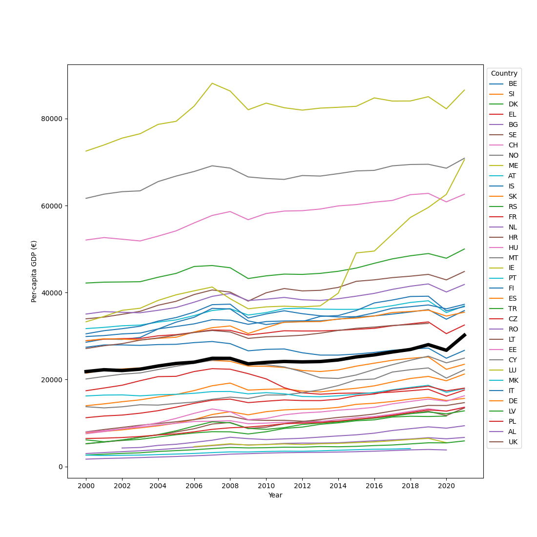
Creating subplots
You can create subplots with plt.subplot(). This takes a number of rows, a number of columns, and then the number of the subplot, where subplots are numbered from left to right and then from top to bottom. So if you have 3 (rows) x 3 (columns) plot, then subplot 4 would be the first subplot on the middle row.
You can use plt.subplots_adjust() to add some spacing between the rows (hspace) and the columns (wspace).
from datamatrix import operations as ops

dm_female, dm_male = ops.split(dm.Gender, 'Female', 'Male')
plt.subplots_adjust(wspace=.4)
plt.subplot(1, 2, 1)
plt.title('Women')
sns.barplot(x='Group', y='Heart Rate', data=dm_female)
plt.ylim(90, 160)
plt.xlabel('Group')
plt.ylabel('Heart rate')
plt.subplot(1, 2, 2)
plt.title('Men')
sns.barplot(x='Group', y='Heart Rate', data=dm_male)
plt.ylim(90, 160)
plt.xlabel('Group')
plt.ylabel('Heart rate')
plt.show()
Exercises
Plotting rank-ordered ratings for 90s movies
Using this dataset, for each year in the 90s separately, plot the ratings for individual movies, rank-ordered such that the lowest-rated movies start on the left. The resulting plot consists of ten lines (for each year in the 90s) that gradually go up, with each datapoint corresponding to a single movie rating.
Plotting heart-rate distributions in subplots
Use this dataset from Moore, McCabe, & Craig to create a two-by-two plot, and in each subplot show the distribution of heart rate for one combination of gender and group of participants (Men Runners, Men Control, Female Runners, Female Control).
You're done with this section!
Continue with Statistics >>