

Analyzing time series with DataMatrix
What are time series?
Say that you have a group of children. For each child, you write down his or her name and height. The result is a simple dataset of the kind that we've seen before, which you can represent as a spreadsheet with two columns (name and height) and one row for each child. You could plot this dataset as a simple bar plot (see Figure 1a).
Now say that you measure the height of these children once a month for a year. The dataset now has a different structure, because for each name you now have twelve height values. Data of this kind is often called a time series, because it commonly (but not only) occurs for data sets in which some measure is tracked over time. You could plot this dataset as a line plot where the x-axis corresponds to time, the y-axis corresponds to height, and different lines correspond to different children (see Figure 1b).
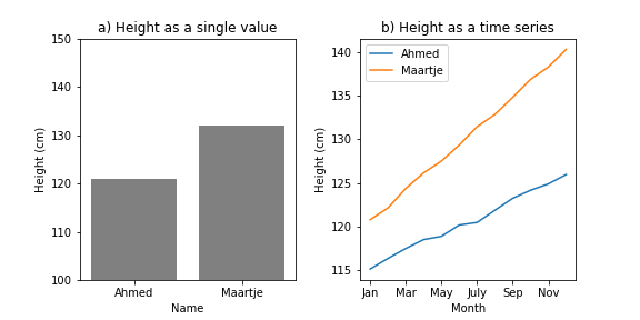
Figure 1.
Other examples of time series are:
- Historical data from stock exchanges. Here, each company has a time series associated with it that reflects how the company's share price has changed over time.
- Heart-rate data from an experiment in which heart rate was measured over time for a group of participants (as opposed to being aggregated into a single average heart-rate value per participant). Here, each participant has a time series associated with it that reflects how that participant's heart rate changed over time.
Libraries for working with time series
In this chapter, we will use the datamatrix SeriesColumn, which is a type of column in which each cell is itself a series of values. This chapter assumes that you've already followed the basic DataMatrix chapter earlier in this series on data science.
For a list of functions for working with series columns, see the datamatrix documentation:
Another commonly used library for working with time series is Pandas, which provides the pandas.Series class. We will not use Pandas for this tutorial.
Loading data
In this chapter, we will analyze the per-capita gross domestic product (GDP) for several European countries in the period 2000 - 2021. Per-capita GDP reflects how many paid services and goods were on average produced by a single person in that country; this is a rough indicator of a country's wealth, although it suffers from many imperfections, such as that services that are provided for (almost) free by the state are largely disregarded.
This data comes originally from EuroStat, where you can find the raw data as 'Real GDP per capita'. But I have reformatted it slightly for this chapter. You can download the reformatted data here.
Let's start by loading in the data and printing it out to explore its structure:
from datamatrix import io

dm = io.readtxt('data/eurostat-gdp.csv')
print(dm)
Output:
+----+---------+------+------+
| #  | country | gdp  | year |
+----+---------+------+------+
| 0  |    AL   | 1700 | 2000 |
| 1  |    AL   | 1850 | 2001 |
| 2  |    AL   | 1940 | 2002 |
| 3  |    AL   | 2060 | 2003 |
| 4  |    AL   | 2180 | 2004 |
| 5  |    AL   | 2310 | 2005 |
| 6  |    AL   | 2460 | 2006 |
| 7  |    AL   | 2630 | 2007 |
| 8  |    AL   | 2850 | 2008 |
| 9  |    AL   | 2960 | 2009 |
| 10 |    AL   | 3090 | 2010 |
| 11 |    AL   | 3180 | 2011 |
| 12 |    AL   | 3230 | 2012 |
| 13 |    AL   | 3260 | 2013 |
| 14 |    AL   | 3330 | 2014 |
| 15 |    AL   | 3410 | 2015 |
| 16 |    AL   | 3530 | 2016 |
| 17 |    AL   | 3670 | 2017 |
| 18 |    AL   | 3830 | 2018 |
| 19 |    AL   | 3920 | 2019 |
+----+---------+------+------+
(+ 758 rows not shown)
Right now, the structure of the data is such that there is one row for every country and every year, and per-capita GDP is represented as a single value. For example, the first row shows that the per-capita GDP for Albania (AL) in the year 2000 was €1700.
Dealing with invalid data
Per-capita GDP values in this dataset are integers. This means that everything that is not an int is invalid data. Let's see what we get if we select those rows in which dm.gdp is not of type int:
print(dm.gdp != int)
Output:
+-----+---------+-----+------+
|  #  | country | gdp | year |
+-----+---------+-----+------+
| 627 |    RO   |     | 2000 |
| 628 |    RO   |     | 2001 |
+-----+---------+-----+------+
Ok, that's useful to know! The per-capita GDP of Romania (RO) in the years 2000 and 2001 is indicated by an empty string. This will cause problems later, because an empty string is not a number. In other words, for our purpose these two values are invalid data. To deal with this, we change these two values to NAN, which is a numerical (float) value that indicates missing data in a way that most numerical libraries know how to deal with.
from datamatrix import NAN

dm.gdp[dm.gdp != int] = NAN
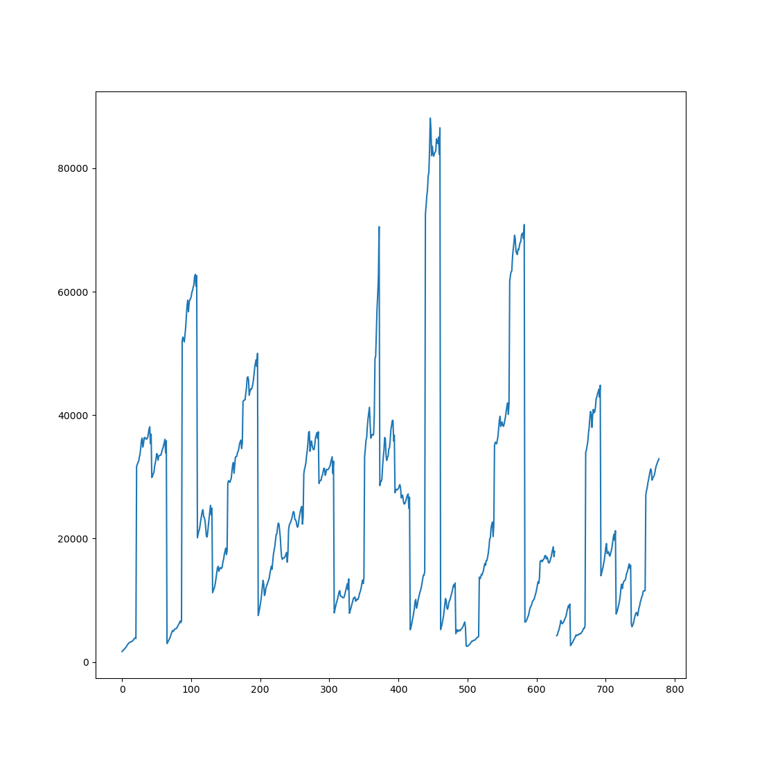
Now that our data contains only numbers, we can plot it as a simple line plot. Admittedly, this plot is not very useful, because it plots all per-capita GDP values as a single line, without indicating which values belong to which countries and which years. Do you see the discontinuity around 620 on the x-axis? Those are the two NAN values that we inserted into the data above.
from matplotlib import pyplot as plt

plt.plot(dm.gdp)
plt.show()
Mini exercise
Instead of changing empty strings in the gdp column to NAN values, remove those rows from the datamatrix altogether.
Restructuring data as a time series
At this point, while our data is conceptually a time series, it is still represented as a regular two-dimensional spreadsheet. We can do better! Let's restructure the data into a more convenient format. Specifically, each row should correspond to a single country; this means that each row will have multiple values for year and GDP, because both of these are time series associated with countries, in the same way that height was a time series associated with names in Figure 1b.
This restructuring is done by the group() function from the datamatrix.operations module. This function takes a datamatrix and one or more columns from this datamatrix to group by. In our case, we group by country and print out the resulting datamatrix, which we call sm, to explore the new structure:
from datamatrix import operations as ops

sm = ops.group(dm, by=dm.country)
print(sm)
print(f'Each country has {sm.gdp.depth} values for GDP')
print(f'Each country has {sm.year.depth} values for year')
Output:
+----+---------+-----------------------------------+-------------------------------+
| #  | country |                gdp                |              year             |
+----+---------+-----------------------------------+-------------------------------+
| 0  |    BE   | [29890. 30110. ... 33870. 35850.] | [2000. 2001. ... 2020. 2021.] |
| 1  |    SI   | [13980. 14410. ... 19720. 21260.] | [2000. 2001. ... 2020. 2021.] |
| 2  |    DK   | [42190. 42390. ... 47890. 50010.] | [2000. 2001. ... 2020. 2021.] |
| 3  |    EL   | [17430. 18050. ... 16180. 17590.] | [2000. 2001. ... 2020. 2021.] |
| 4  |    BG   |   [2990. 3210. ... 6380. 6690.]   | [2000. 2001. ... 2020. 2021.] |
| 5  |    SE   | [33960. 34360. ... 42910. 44840.] | [2000. 2001. ... 2020. 2021.] |
| 6  |    CH   | [52080. 52640. ... 60850. 62600.] | [2000. 2001. ... 2020. 2021.] |
| 7  |    NO   | [61660. 62620. ... 68590. 70870.] | [2000. 2001. ... 2020. 2021.] |
| 8  |    ME   |   [4580. 4890. ...   nan   nan]   | [2006. 2007. ...   nan   nan] |
| 9  |    AT   | [31710. 31990. ... 35390. 36920.] | [2000. 2001. ... 2020. 2021.] |
| 10 |    IS   | [28570. 29310. ... 35800. 36760.] | [2000. 2001. ... 2020. 2021.] |
| 11 |    SK   | [ 7780.  8060. ... 15180. 15660.] | [2000. 2001. ... 2020. 2021.] |
| 12 |    RS   |   [2650. 2840. ... 5440. 5890.]   | [2000. 2001. ... 2020. 2021.] |
| 13 |    FR   | [28930. 29290. ... 30550. 32530.] | [2000. 2001. ... 2020. 2021.] |
| 14 |    NL   | [35060. 35610. ... 40130. 41860.] | [2000. 2001. ... 2020. 2021.] |
| 15 |    HR   | [ 7970.  8510. ... 11730. 13460.] | [2000. 2001. ... 2020. 2021.] |
| 16 |    HU   | [ 7910.  8260. ... 12710. 13660.] | [2000. 2001. ... 2020. 2021.] |
| 17 |    MT   | [13750. 13480. ... 20330. 22250.] | [2000. 2001. ... 2020. 2021.] |
| 18 |    IE   | [33280. 34510. ... 62570. 70530.] | [2000. 2001. ... 2020. 2021.] |
| 19 |    PT   | [16230. 16430. ... 17070. 17920.] | [2000. 2001. ... 2020. 2021.] |
+----+---------+-----------------------------------+-------------------------------+
(+ 16 rows not shown)
Each country has 22 values for GDP
Each country has 22 values for year
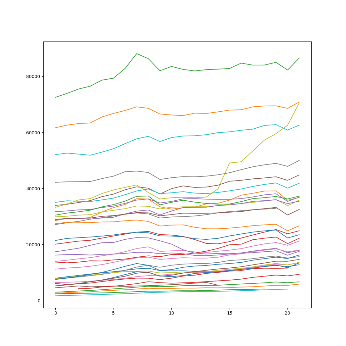
Both gdp and year are a special type of column (SeriesColumn objects) that has been designed to represent time series. Specifically, in a series column a single cell doesn't contain a single value, as is the case for regular columns such as country, but rather contains multiple values. The depth property of a series column indicates how many values there are in each cell. In our case, the depth of the gdp and year columns is 22, which makes sense because our dataset spans 22 years (2000 until and including 2021).
We can now plot our dataset in a more useful way by creating a line plot in which the x-axis reflects time (imperfectly for now!) and each line corresponds to a single country. (The plottable property of a series column provides the time-series data in a format that plt.plot() understands.)
plt.plot(sm.gdp.plottable)
plt.show()
Mini exercise
Create a plot like the one above, but with only data from the Scandinavian countries: Denmark (DK), Norway (NO), Sweden (SE), Finland (FI), and Iceland (IS).
Understanding the structure of time series
A few notes to avoid confusion:
The length of a series column (len(sm.gdp)) is equal to the length of the datamatrix and thus reflects the number of rows. The depth of a series column reflects the number of values (or: samples, time points, observations, etc.) in the time series.
You can think of a series column as having 3 dimensions, as opposed to the 2 dimensions of a regular column.
- The first dimension is the column name; this works the same as for a regular column
- The second dimension is the row number; this works the same for a regular column
- The third dimension is the sample number within the series; this is unique for series columns
Let's consider some examples. The first row (0) of gdp is a numpy array. This array reflect how gdp changes over the years for the country corresponding to the first row.
print(sm.country[0])
print(sm.gdp[0])
Output:
BE
[29890. 30110. 30490. 30680. 31640. 32200. 32800. 33760. 33640. 32700.
 33330. 33460. 33490. 33490. 33870. 34360. 34620. 35050. 35530. 36080.
 33870. 35850.]
The last value (-1) from the first row (0) of gdp is a single value. This value reflects the per-capita GDP in the last year of the time series (2021) for the country corresponding to the first row.
print(sm.country[0])
print(sm.gdp[0, -1])
Output:
BE
35850.0
The last value (-1) from all rows (:) is a column. This column reflects the per-capita GDP in the last year of the time series (2021) for all rows.
print(sm.country[:])
print(sm.gdp[:, -1])
Output:
col['BE', 'SI', 'DK', 'EL', 'BG', 'SE', 'CH', 'NO', 'ME', 'AT', 'IS', 'SK', 'RS', 'FR', 'NL', 'HR', 'HU', 'MT', 'IE', 'PT', 'FI', 'ES', 'TR', 'CZ', 'RO', 'LT', 'EE', 'CY', 'LU', 'MK', 'IT', 'DE', 'LV', 'PL', 'AL', 'UK']
col[35850. 21260. 50010. 17590.  6690. 44840. 62600. 70870.    nan 36920.
 36760. 15660.  5890. 32530. 41860. 13460. 13660. 22250. 70530. 17920.
 37290. 23510.    nan 18020.  9380. 14690. 16260. 24920. 86550.    nan
 26700. 35480. 12800. 13580.    nan    nan]
Mini exercise
Print out the per-capita GDP for France (FR) in the years 2006 through 2010.
Dealing with missing data
The dataset spans the years 2000 until and including 2021. However, data is not available for all countries for all years. Specifically, for some countries data is missing for the first few years. We've already seen an example of this above, when we recoded the invalid data for Romania for 2000 and 2001. But for a few other countries, some data is simply missing altogether, not even represented by empty strings.
This is characteristic of real-world time-series data: data is often incomplete in multiple ways, and it's therefore important to check your data carefully.
Let's first print out the first value (0) of the year column for all (:) countries:
print(sm.year[:, 0])
Output:
col[2000. 2000. 2000. 2000. 2000. 2000. 2000. 2000. 2006. 2000. 2000. 2000.
 2000. 2000. 2000. 2000. 2000. 2000. 2000. 2000. 2000. 2000. 2000. 2000.
 2000. 2000. 2000. 2000. 2000. 2000. 2000. 2000. 2000. 2000. 2000. 2000.]
Most values are 2000, indicating that GDP values are available from 2000 onwards. However, there is one exception: 2006. So what country corresponds to this exception?
print(sm.year[:, 0] != 2000)
Output:
+---+---------+-------------------------------+-------------------------------+
| # | country |              gdp              |              year             |
+---+---------+-------------------------------+-------------------------------+
| 8 |    ME   | [4580. 4890. ...   nan   nan] | [2006. 2007. ...   nan   nan] |
+---+---------+-------------------------------+-------------------------------+
It's Montenegro (ME), which declared independence from Serbia in 2006.
The fact that the first gdp value for Montenegro corresponds to 2006, whereas the first value for all other countries corresponds to 2000, means that the data is misaligned. So how can we re-align the data?
Imagine that we take the time series for Montenegro, as shown above, and shift all values to the right by 6 positions, thus compensating for the six missing years at the start. The values that fall off the end, which are all NAN, should then wrap around so that they move to the start of the series. This is exactly what the roll() function from datamatrix.series does!
We can pass a single shift value to roll(), in which case all rows are shifted by the same amount. But that's not what we want here, because we want to shift the row corresponding to Montenegro by 6, whereas we don't want to shift the other rows at all. Fortunately, roll() can also takes a sequence of values for the shift parameter so that each row can be shifted by a different amount.
In our case, for each row, the shift value is equal to the first value of the year series minus 2000. For Montenegro, this results in 6, because the year series starts at 2006 (2006 - 2000 = 6). For all other countries, this results in 0, because the year series starts at 2000 (2000 - 2000 = 0). We apply roll() to both the gdp and year series:
from datamatrix import series as srs

shift = sm.year[:, 0] - 2000
print(shift)
sm.year = srs.roll(sm.year, shift)
sm.gdp = srs.roll(sm.gdp, shift)
print(sm)
Output:
col[0. 0. 0. 0. 0. 0. 0. 0. 6. 0. 0. 0. 0. 0. 0. 0. 0. 0. 0. 0. 0. 0. 0. 0.
 0. 0. 0. 0. 0. 0. 0. 0. 0. 0. 0. 0.]
+----+---------+-----------------------------------+-------------------------------+
| #  | country |                gdp                |              year             |
+----+---------+-----------------------------------+-------------------------------+
| 0  |    BE   | [29890. 30110. ... 33870. 35850.] | [2000. 2001. ... 2020. 2021.] |
| 1  |    SI   | [13980. 14410. ... 19720. 21260.] | [2000. 2001. ... 2020. 2021.] |
| 2  |    DK   | [42190. 42390. ... 47890. 50010.] | [2000. 2001. ... 2020. 2021.] |
| 3  |    EL   | [17430. 18050. ... 16180. 17590.] | [2000. 2001. ... 2020. 2021.] |
| 4  |    BG   |   [2990. 3210. ... 6380. 6690.]   | [2000. 2001. ... 2020. 2021.] |
| 5  |    SE   | [33960. 34360. ... 42910. 44840.] | [2000. 2001. ... 2020. 2021.] |
| 6  |    CH   | [52080. 52640. ... 60850. 62600.] | [2000. 2001. ... 2020. 2021.] |
| 7  |    NO   | [61660. 62620. ... 68590. 70870.] | [2000. 2001. ... 2020. 2021.] |
| 8  |    ME   |   [  nan   nan ... 5490.   nan]   | [  nan   nan ... 2020.   nan] |
| 9  |    AT   | [31710. 31990. ... 35390. 36920.] | [2000. 2001. ... 2020. 2021.] |
| 10 |    IS   | [28570. 29310. ... 35800. 36760.] | [2000. 2001. ... 2020. 2021.] |
| 11 |    SK   | [ 7780.  8060. ... 15180. 15660.] | [2000. 2001. ... 2020. 2021.] |
| 12 |    RS   |   [2650. 2840. ... 5440. 5890.]   | [2000. 2001. ... 2020. 2021.] |
| 13 |    FR   | [28930. 29290. ... 30550. 32530.] | [2000. 2001. ... 2020. 2021.] |
| 14 |    NL   | [35060. 35610. ... 40130. 41860.] | [2000. 2001. ... 2020. 2021.] |
| 15 |    HR   | [ 7970.  8510. ... 11730. 13460.] | [2000. 2001. ... 2020. 2021.] |
| 16 |    HU   | [ 7910.  8260. ... 12710. 13660.] | [2000. 2001. ... 2020. 2021.] |
| 17 |    MT   | [13750. 13480. ... 20330. 22250.] | [2000. 2001. ... 2020. 2021.] |
| 18 |    IE   | [33280. 34510. ... 62570. 70530.] | [2000. 2001. ... 2020. 2021.] |
| 19 |    PT   | [16230. 16430. ... 17070. 17920.] | [2000. 2001. ... 2020. 2021.] |
+----+---------+-----------------------------------+-------------------------------+
(+ 16 rows not shown)
Mini exercise
Create a new column that indicates, for each country separately, the number of years for which data is missing. To do this, you can use the nancount() function from datamatrix.series.
Visualizing and summarizing
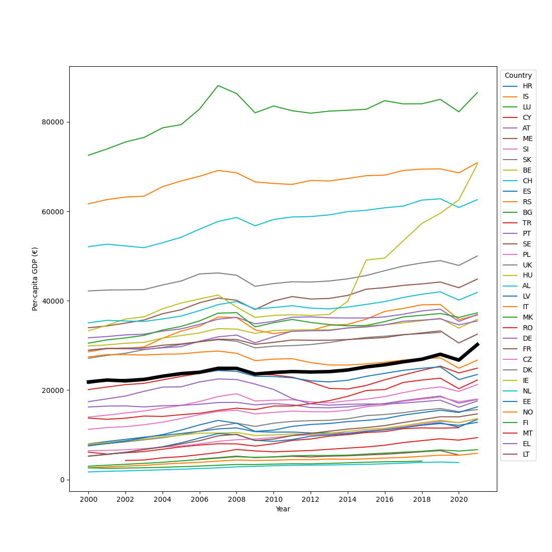
We can now create a similar plot to the one that we created before, but this time our visualization is accurate because we have properly aligned the data. We can also add a legend so that we can tell which line corresponds to which country. And we can plot a thick black line to indicate the mean per-capita GDP across countries (sm.gdp.mean).
plt.figure(figsize=(11, 11))
plt.plot(sm.gdp.plottable, label=sm.country)
plt.plot(sm.gdp.mean, color='black', linewidth=5)
plt.xticks(range(0, 22, 2), range(2000, 2022, 2))
plt.xlabel('Year')
plt.ylabel('Per-capita GDP (€)')
plt.legend(title='Country', bbox_to_anchor=(1, 1))
plt.show()
The plot above is a bit overwhelming, but it does highlight some general patterns. Notably, GDP tends to increase over time, with the exception of the years following the 2008 financial crisis and a brief dip in 2020 related to the corona epidemic.
Let's simplify the data to getter a better picture. Specifically, let's get the mean per-capita GDP over the 2000 - 2021 period for each country separately. We can use the reduce() function from datamatrix.series to do this. To 'reduce' is a somewhat technical term for the general concept of taking a series of values and 'reducing' it to a single value. By default, this happens by taking the mean.
To avoid confusion: srs.reduce(sm.gdp) gives the mean per-capita GDP for each country averaged over years, whereas sm.gdp.mean (which we used above for plotting) gives the mean GDP for each year averaged over countries.
Finally, we sort the datamatrix by mean per-capita GDP so that the resulting plot is rank-ordered and thus even easier to understand.
sm.mean_gdp = srs.reduce(sm.gdp)
sm = ops.sort(sm, by=sm.mean_gdp)
plt.figure(figsize=(11, 4))
plt.plot(sm.country, sm.mean_gdp, 'o')
plt.xlabel('Country')
plt.ylabel('Mean per-capita GDP 2000 - 2021 (€)')
plt.show()
This plot shows extreme differences in per-capita GDP between countries, ranging from €2,914 in Albania to €81,739 in Luxembourg. To some extent these differences reflect actual differences in wealth. But they also reflect whether or not a country has a large banking system (Luxembourg being an extreme example), because moving money around adds to the GDP just as much as producing physical products does.
Finally, let's look at the per-capita GDP growth rate, which requires a slightly more complex reduce operation. As mentioned above, reduce() by default takes the mean of a series across time. However, you can also specify a different operation by passing a custom function through the operation keyword. This function should accept a 1D array as a sole argument and return a single value. In our case, the 1D array corresponds to all per-capita GDP values over time for a single country; that is, the reduce operation is done per country.
To determine the per-capita GDP growth rate, we can define a custom reduce function, get_slope(), that performs a linear regression on the GDP values for each country, and returns the slope of the regression line. Internally, this function uses linregress() from scipy.stats, which cannot handle NAN values; therefore, we need to exclude those.
import numpy as np
from scipy.stats import linregress

def get_slope(y):
    y = y[~np.isnan(y)]    # only keep numeric (non-NAN) values
    x = np.arange(len(y))  # define x values
    slope, intercept, r, p, se = linregress(x, y)
    return slope

sm.gdp_growth = srs.reduce(sm.gdp, operation=get_slope)
Now we can create a scatter plot with mean GDP on the x-axis and GDP growth rate on the y-axis.
plt.axhline(0, linestyle=':', color='black')
plt.plot(sm.mean_gdp, sm.gdp_growth, 'o')
plt.xlabel('Mean per-capita GDP 2000 - 2021 (€)')
plt.ylabel('Per-capita GDP growth rate 2000 - 2021 (€)')
plt.show()
Most countries show moderate positive growth. However, two countries, those corresponding to the two points below the dotted line, show negative growth. And one country shows extremely rapid growth. Which countries are those?
sm_extremes = (sm.gdp_growth < 0) | (sm.gdp_growth > 1000)
plt.figure(figsize=(11, 5))
plt.plot(sm_extremes.gdp.plottable, label=sm_extremes.country)
plt.xticks(range(0, 22, 2), range(2000, 2022, 2))
plt.xlabel('Year')
plt.ylabel('Per-capita GDP (€)')
plt.legend(title='Country', bbox_to_anchor=(1, 1))
plt.show()
The shrinking per-capita GDPs correspond to Greece (EL) and Italy (IT), neither of which really recovered from the 2008 financial crisis. The rapidly expanding economy corresponds to Ireland (IE), which due to attractive tax schemes is the European financial home for many multinationals; the creative bookkeeping of those multinationals makes the Irish per-capita GDP particularly volatile.
Review exercise
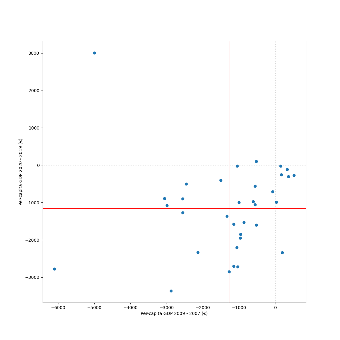
The impact of crises
Take the datamatrix (sm) that you have constructed during this chapter. During the period that this dataset spans, two major crises occurred: the 2008 financial crisis and the 2020 corona crisis.
First, quantify the impact of both crises on the per-capita GDP of each country. For the 2008 financial crisis, the impact can be quantified as the difference between per-capita GDP in 2009 and 2007. For the corona crisis, the impact can be quantified as the difference between 2020 and 2019.
Next, create a scatter plot with the 2008-crisis impact on the x-axis, the corona-crisis impact on the y-axis, and individual countries as points. Draw dotted black lines (one horizontal and one vertical) through the 0 points for both axes. Draw solid red lines (one horizontal and one vertical) to indicate the mean impact of each crisis across countries.