


Time series: Exercises and Solutions
The impact of crises
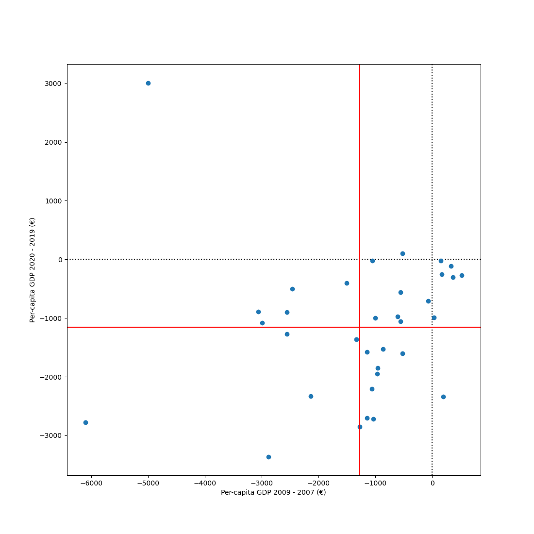
Exercise
Take the datamatrix (sm) that you have constructed during this chapter. During the period that this dataset spans, two major crises occurred: the 2008 financial crisis and the 2020 corona crisis.
First, quantify the impact of both crises on the per-capita GDP of each country. For the 2008 financial crisis, the impact can be quantified as the difference between per-capita GDP in 2009 and 2007. For the corona crisis, the impact can be quantified as the difference between 2020 and 2019.
Next, create a scatter plot with the 2008-crisis impact on the x-axis, the corona-crisis impact on the y-axis, and individual countries as points. Draw dotted black lines (one horizontal and one vertical) through the 0 points for both axes. Draw solid red lines (one horizontal and one vertical) to indicate the mean impact of each crisis across countries.
Solution
First, load the data and process it. These are the same steps as described in more detail in the chapter.
from datamatrix import io, NAN, series as srs, operations as ops

dm = io.readtxt('data/eurostat-gdp.csv')
dm.gdp[dm.gdp != int] = NAN
sm = ops.group(dm, by=dm.country)
shift = sm.year[:, 0] - 2000
sm.year = srs.roll(sm.year, shift)
sm.gdp = srs.roll(sm.gdp, shift)
Next, solve the exercise!
from matplotlib import pyplot as plt

sm.gdp_2009_2007 = sm.gdp[:, 9] - sm.gdp[:, 7]
sm.gdp_2020_2019 = sm.gdp[:, 20] - sm.gdp[:, 19]
plt.figure(figsize=(11, 11))
plt.axhline(0, color='black', linestyle=':')
plt.axvline(0, color='black', linestyle=':')
plt.plot(sm.gdp_2009_2007, sm.gdp_2020_2019, 'o')
plt.xlabel('Per-capita GDP 2009 - 2007 (€)')
plt.ylabel('Per-capita GDP 2020 - 2019 (€)')
plt.axvline(sm.gdp_2009_2007.mean, color='red')
plt.axhline(sm.gdp_2020_2019.mean, color='red')
plt.show()
You're done with this section!
Continue with Time series >>